Why Do My Blue Come Out Purple
Printing Blues: Why does blue sometimes come out purple in print?
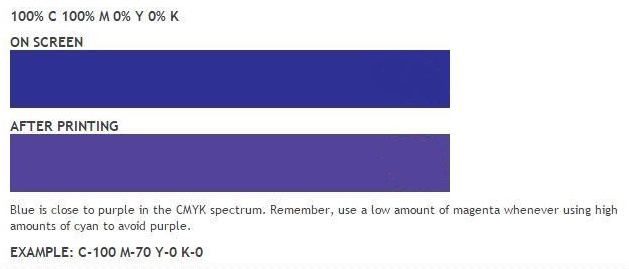
You may be seeing something like this, for example:
This is what we like to refer to as having The Printing Blues.
There are a few specific reasons why this is the case. We will do our best to break it down for you.
First of all, when we are looking at our designs on a computer screen, we are looking at a completely different color model than the color model used to print our designs. The computer screen displays color using the RGB color model (Red, Green, Blue).
For print, the CMYK color model is used (Cyan Magenta, Yellow and Black).
You might be asking: Why does the computer use RGB, while CMYK is used for print? Well, first you need to know that RGB is known as an “additive” color model, while CMYK is a “subtractive” color model.
The computer monitor projects color using light, so in an additive color model, red, green, and blue light are added together in various ways to reproduce a broad array of colors. When combined, RGB produces white light, as you can see in the center of the image below:
While the RGB model creates, or adds light, the CMYK model, on the other hand, works by partially or entirely masking colors on a lighter, usually white, background. The ink reduces the light that would otherwise be reflected. Such a model is called subtractive because inks “subtract” brightness from white. See the image below:
So this all leads to the final point. Why does your design look different after it is printed? When designing for print, you first must make sure that your printed materials are designed or prepared within the CMYK color mode. When you begin in CMYK, there will be less of a difference once the design is printed.
However, many times, the colors can still be slightly different than what you were expecting, specifically when printing blues.
Printing blues can be tricky because it is very close to purple within the CMYK spectrum and often times there is too much Magenta mixed in with the Cyan. If your design is coming out too purple, the key rule of thumb is to make sure to leave at least a 30% difference in your Cyan and Magenta values. Let’s revisit the initial image below, with modified color values displayed.
Now, you should be well on your way to making sure your brand identity is consistent and accurate when all of your printed materials come out with the colors that you originally expected. Cheer up, The Printing Blues are over!
One advantage to using a digital printer like Creation Station is that we can ensure that your prints come out the way you expect them to. We send out a printed proof before the printing process begins to ensure that your blues come out blue! If you have any more questions relating to print in any way we are always happy to help.


