Your Ultimate Guide To Designing The Ideal Outdoor Banner For An Event
You'll want to rise to the occasion by proudly raising your outdoor banner for all to see. You don't want to be wise after the event, so take a few moments to think about the design.
Make the best first impression as guests arrive by creating signage that's banner-tastic!


Make a Bold Statement
All the elements of your outdoor banner should compliment each other. These key features are color, imagery, font, and purpose. Get this right and you will create a clear presentation that is simple to understand at a glance.
1. The Purpose of the Outdoor Banner
A good question to ask yourself is, 'What am I trying to achieve with my banner?'
You may want to communicate a message or promote a type of branding. If your event's a large one then you may need several banners and some advertising flags for different purposes.
These could range from signs to direct traffic to large banners to attract more attendees. Once you have a clear purpose for your signage in mind, you'll be ready to start focusing on the design.
2. Size Matters
Consider where the banner is going to be in relation to your target audience. Let's say your banner will be hung on the outside of a building but a few hundred feet away from where most people will see it.
Intricate design themes like decorative borders would be lost at this kind of distance. Once you've worked out the average viewing distance, follow a simple rule. Allow ten inches of letter height for every hundred feet of visibility.
Check with the Printer
Always keep readability and visibility in mind. That means following printing guidelines. Make sure you don't place any vital words or design elements outside of template safe areas.
Extend backgrounds to bleed areas. They're there to make sure important information doesn’t get trimmed off. Every inch of your banner has value. Having said that, don't over-complicate the design.
3. Effective Colors
Colors draw in the eye and increase memory retention. Good contrasting colors mean good readability. A dark text on a light background or a light text on a dark background works really well.
Some people say light on dark is best because we're more used to seeing that. For example, this is the technique used on highway signs. Our eyes have therefore become familiar with this kind of contrast.
Whichever colors you choose, ensure that they are contrasting but complimentary. Use splashes of bright colors to draw in the eye.
Go for Bold
Don't be afraid to choose bold and attention-grabbing colors. But again, keep things simple. Too many colors can be confusing.
The focal point is what the human eye is drawn to when it sees a design. Keep the element that makes the biggest impact in your design close to the focal point. You could use white space to isolate focal points to help them stand out.
Nothing adds a bit of color like graphics or pictures. These images should always come from high-resolution files. If not, the banner will end up looking pixelated and distorted.
Remember the larger the banner, the better resolution you'll need in your graphics and pictures.
4. Fabulous Fonts
Outdoor banners should often be big and imposing. They need to capture the attention of people who see them, no matter how far away they are. It's a big mistake to select the wrong font for the banner.
Select a font size that can be easily read and seen from the required distance. When it comes to the type of font, avoid using scripts, scrunched block letters, or ultra-thin characters. Any font that gives a 'hand-written' effect won't work well.
Remember that at best, you’ll only win people's attention for a few seconds. That's if you are able to attract their attention at all. Make the best use of this opportunity.
A neutral font like Arial or Helvetica would be a good choice. That will help you to get your point across easily and quickly. A script font like Mistral works well for other purposes but not on large banners.
5. When the Banner Is Mounted
You'll have put a lot of work into creating your banner so you don't want to fall at the final hurdle. This means you need to consider how the banner will look when it's mounted.
Avoid a design that's going to cover the whole banner. This won't take into account how the final product will be mounted and displayed. Bear in mind where any holes are likely to be for hanging purposes.
Consider the type of weather there might be once the banner is mounted. If there are likely to be strong breezes then a mesh banner would be a good choice. That'll help prevent the wind from catching and the banner from flapping.
6. Make Sure You Brand it!
Branding elements on your banner will take you back to your choice of color. Always make a point of staying within your brand’s colors and font. Incorporate any logos or slogans into your banner design that are often used by your company.
Think of a company banner as a portable way to advertise your brand. People should see the banner and associate it with your business straightaway.
7. Your Call to Action
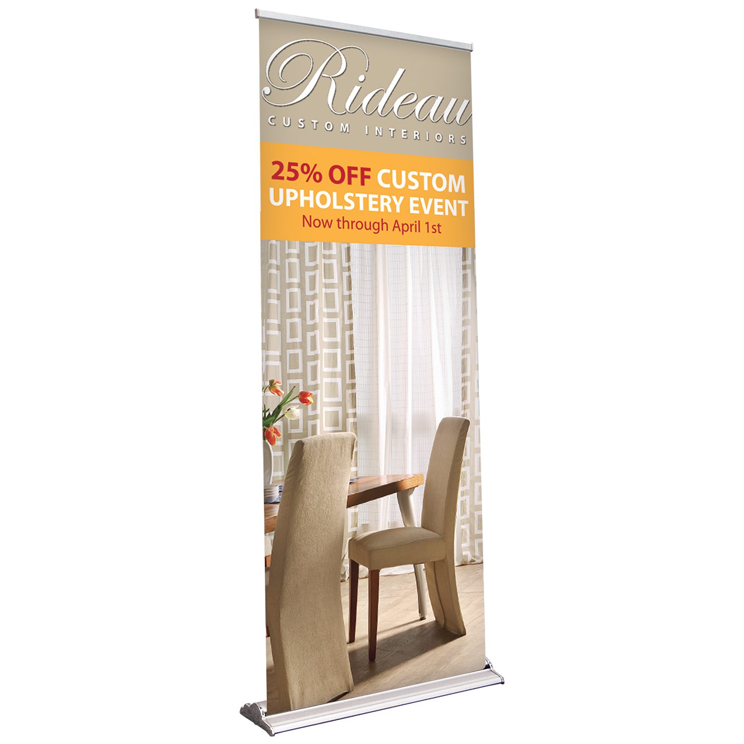
The most effective banner designs are those which have a very clear call to action. You may have the most beautiful banner design but if there isn't a carefully thought through 'call to action' or CTA, people will not act.
Make sure the CTA is in a prominent place on the banner. Use a few easy to understand words. Here are a few examples of CTA’s:
- Come and get a free sample!
- Call us right now!
- Visit our website!
- Book right now!
Always add a web address that people can go to on the day with their smartphones. Better still, make a connection between what they will see on the site with the event.
Continue reading our blog for more useful articles. Find out here how to install a step and repeat banner stand.
Takeaway
At Creation Station Printing, we believe in providing our clients with everything they need under one roof. This means that we offer a wide range of services and products that cater to your specific needs and requirements.
We have a team of experts who are available to help you every step of the way. So if you're looking for quality printing services that will exceed your expectations this is the place to be.
Imagine, being able to go to your print provider, get every single item you might need from one place, and know that you are going to get the best price at all times.
Now that’s loyalty.
Check out Creation Station Printing today and ask them about their custom branded storefronts. This will start the conversation that could change the way your company does print forever.
Want to Learn More?
Check out more info about how we can build you your own custom branded business storefront and let us become your in house print shop today!
