6 Promotional Flyer Design Mistakes to Avoid
6 Promotional Flyer Design Mistakes to Avoid
Maybe you want people to come and see your band? Perhaps you provide a service that you want to make people aware of? In any case, you're looking to make a promotional flyer.
But of course, before you get your flyer printed, you have to design it. If you're not a marketing-oriented type of person, this can be challenging.
That's why you're reading this article: you need help. Fortunately, we're prepared to provide it to you, not by telling you what to do but by telling you what not to do.
So, without further ado, here are 6 flyer design mistakes to avoid.


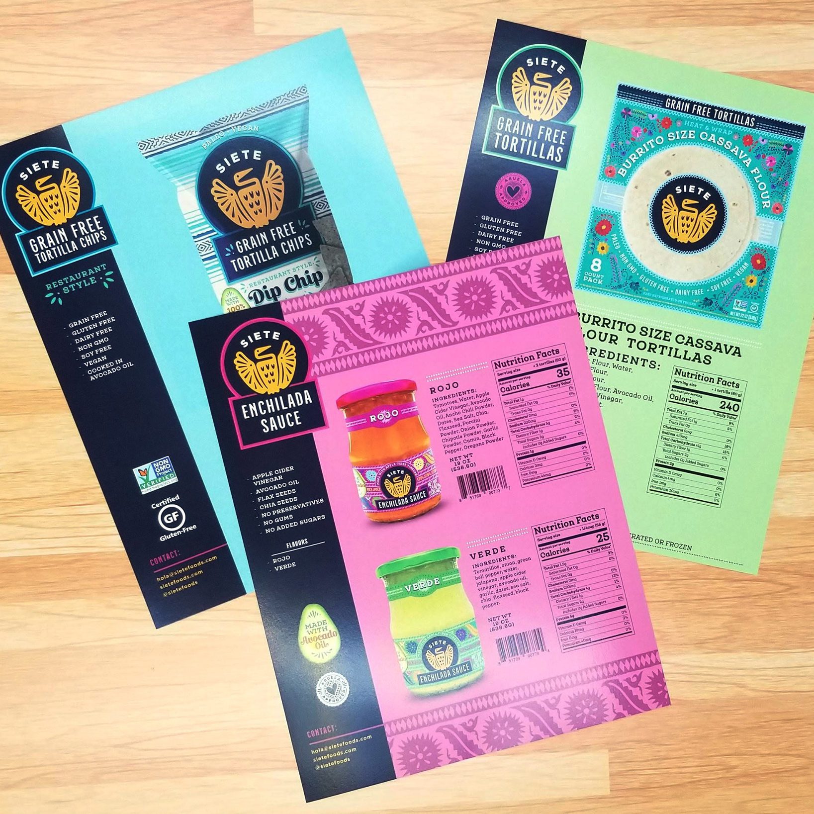
A promotional flyer and other materials can be great to promote a new product or business policy. Here's what you shouldn't do.
1. Overloading the Flyer
Flyers should be fairly simple and straightforward. They should get information across quickly and require little effort from the person who's looking at them.
This brings us to our first flyer design mistake: overloading the flyer. This includes everything from using too much text to using too many pictures to cramming too many elements onto the flyer and more. All of these can make the flyer difficult to read and, in some cases, can make it overwhelming for those that view it.
Instead of jamming tons of different design elements onto one page, you should use a minimalist design. Employ white space and ensure that separate design elements are, indeed, kept separate.
When it comes to content, only include what's really necessary. This includes your contact information, the thing that's being advertised, and a photo that represents that thing.
This isn't to say that you can't get clever at all. However, if you're going to be clever, make sure that your flyer is still easily understandable. It's more important to be informative than it is to be quirky or funny.
2. Using Too Many Colors
Another mistake that is made during flyer design is using too many colors. If you use too many colors, your flyer will come across as unprofessional. Not to mention, it could be overwhelming to look at, thus resulting in it being thrown in the trash without a second thought.
Ideally, you'll use the colors that represent your brand. So, if your brand colors are, say, blue, red, and white, you'll use blue for the background, red for border purposes, and white for the text.
It's generally a good idea to give each color its own purpose in this way. Doing so helps keep things separated in the viewer's mind. If you use your colors willie-willie without any rhyme or reason, the viewer is bound to become confused and thus stop looking at your flyer entirely.
3. Using Too Many Fonts
Not only should you refrain from using too many colors but you should also refrain from using too many fonts. Again, this has to do with professionalism. A flyer that employs a multitude of fonts comes across as amateurish (ie. the exact opposite of professional).
Plus, using too many fonts can get confusing. See, fonts help organize ideas upon a flyer. They indicate specific design elements such as headers, body text, fine print, and the like. If you're using fonts with little regard for the way that the viewer will perceive them, your flyer will ultimately fail to have a positive effect.
We recommend using 3 fonts maximum and, ideally, 1 or 2 fonts. In truth, the only occasions in which you should be using 3 fonts are when your flyer has a great deal of written information to convey. Apart from that, 1 or 2 will get the job done just fine.
4. Failing to Proofread
One of the gravest mistakes you can make when designing a flyer is failing to proofread it. Even a single typo or grammatical error could sink the legitimacy of your flyer, and potentially even hurt your professional reputation. Therefore, it's imperative that it's grammatically perfect.
First, you yourself should read through it several times. Then, you should have someone else read through it several times. For good measure, you should have one more person read through it.
The more eyes you can get on it, the better off you'll be. Printing hundreds of dollars worth of grammatically errored flyers isn't a good feeling. And posting these flyers with grammatical errors can only stand to hurt your business.
5. Using Poor Quality Images
Another mistake that’s commonly made when creating flyers is using poor-quality images. A blurry image will instantly reduce the quality of your flyer and might even turn people off reading it.
When editing and resizing your image, be sure to use proportional dimensions. Also, be sure that its pixel rate is adequate. We recommend a pixel-per-inch rate of 180 or higher.
6. Utilizing a Bland Headline
At the top of your flyer, you should have a headline. This headline should sum up what your flyer is all about. However, it shouldn’t do it in a bland and boring way; it has to catch attention in some way.
One solution is to ask a question. For instance, your headline could ask something like “Looking to Sell Your Home?” Or, it could be an exclamatory statement, something like “STOP! You’ll regret not reading this.”
The point is that it has to stoke interest. Don’t write an essay.
Ready to Print Your Promotional Flyer?
Have you designed your promotional print materials? Ready to print your promotional flyer? If so, and if you're looking for a print shop, look no further than Creation Station.
We print flyers in all sizes and styles. Regardless of your print design, we can turn it into a physical product.
Have any questions? Contact us now!
Takeaway
At Creation Station Printing, we believe in providing our clients with everything they need under one roof. This means that we offer a wide range of services and products that cater to your specific needs and requirements.
We have a team of experts who are available to help you every step of the way. So if you're looking for quality printing services that will exceed your expectations this is the place to be.
Imagine, being able to go to your print provider, get every single item you might need from one place, and know that you are going to get the best price at all times.
Now that’s loyalty.
Check out Creation Station Printing today and ask them about their custom branded storefronts. This will start the conversation that could change the way your company does print forever.
Want to Learn More?
Check out more info about how we can build you your own custom branded business storefront and let us become your in house print shop today!
